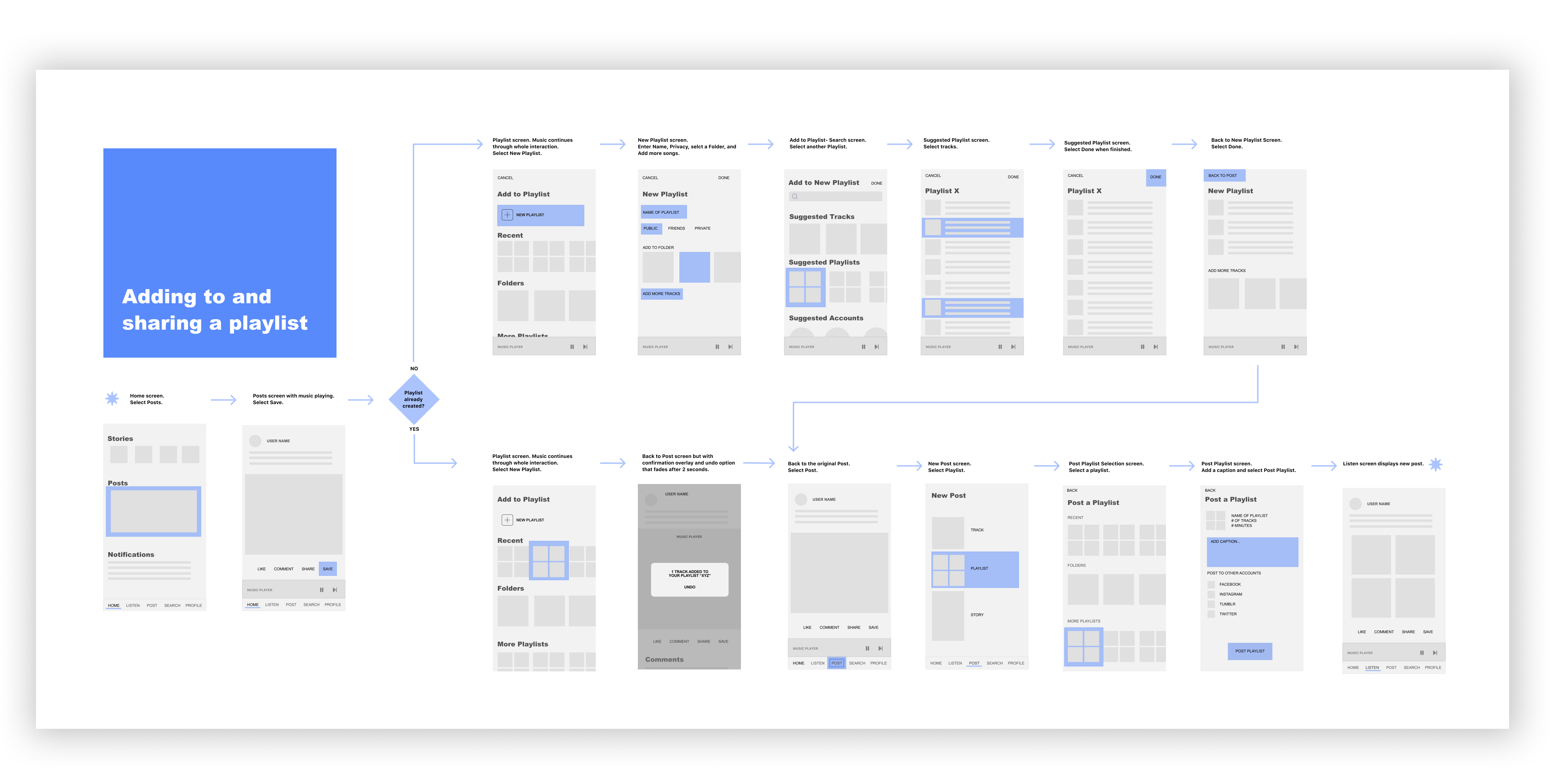
Volumes app screenshots


Volumes is a social music app.

Imagine a social network exclusively for posting your favorite songs and playlists.

You can check out posts from your friends, DJs, or record labels that you follow. It’s a fun way to discover and share new artists with your fellow music lovers.

Volumes app screenshots
challenge

Part I

The Problem


Too Much of a Good Thing

The unimaginable quantity of music being created and released in the internet age is exciting but it leads to some modern grief as well:

  • Decision-anxiety of having too many options
  • Unwanted recommendations by algorithms or sponsored content
  • Fear of missing new music your friends are enjoying
  • Forgetting about meaningful music of the past

Hypothesis

A music-focused social network will help people to feel:

  • The personal touch of getting a trust-worthy recommendation
  • The thrill of sharing new discoveries
  • Connection in reminiscing over old favorites

The Goal

Give music fans a social network focused on sharing, discovering, discussing, saving, and organizing music.

Part II

My Role and Process


This was a self-directed passion project where I took on all responsibilities. But I didn’t do it entirely alone or only for myself. I interviewed other music-lovers to get their input and got them to user-test the resulting prototypes I designed.

My framework was based on Hypothesis-Driven Design and influenced by the Design Thinking approach. I needed to see if other music fans were having similar thoughts, study related products on the market, and finally, build and test a solution of my own.

1. Discover

— Research
— User Interviews
— Competitors

2. Define

— User Scenarios
— Sketching
— Info. Architecture
— Wireflow

3. Build & Test

— Prototyping
— User-Testing
— Repeat!

4. Visual Design

— Branding
— User Interface
— Illustration

Part 1

Discover


Researching Competitors

My research confirmed that I’m not the only one to notice this gap in the app market:

"Apple, Microsoft, Amazon or Google... None of them has really figured out social media in any significant way, never mind social music."

David Bloom

And...

"If you’re Spotify or Apple Music, why would you NOT be thinking about how to bring some of the conversation and connections around music to your platform?"

Stuart Dredge

Of the social media apps, Soundcloud has the best social features but has a very restricted selection of music. Other music apps have limited or no social features.

Volumes app

People already use social media for posting music (see image below) but to find it, you’ll have to scroll through a wild jungle of pet photos and political hot takes. You also probably have friends whose musical tastes don’t match yours. When you do hear a track you like, there’s no way to save the song to your own library. There is also no way to separate music from other types of posts.

examples of music on social media examples of music on social media

People already use social media for music, but not in a dedicated space.

User Interviews

Fortunately, finding actual target users would be easy because posting music on existing social media apps is already practiced. I contacted the frequent music-sharers I saw on Facebook and Instagram and asked them questions about their goals, preferred music services, likes and struggles.

I compiled the most helpful observations into three user personas. Here are a few takeaways:

"I think its fun to play music critic and make top ten lists."

"I own a lot of music but it's never enough. It's a rush to discover a new favorite artist."

"Sharing stories on Instagram with music is like creating a soundtrack to my life."

"I like to see what musical tastes I have in common with other people. Well, CERTAIN people."

"Tidal bombards me with random things that I’m not into."

"Posting music on IG stories are a good way to cut loose from the egotistical posting of social media."

Part 2

Define + Ideate


Ideas I Rejected

  • An automatic system using scrobbling
  • Add a 'Social' section to existing music services
  • Add a 'Music' section to existing social media sites

The downsides:

An automatic system wouldn't give users the satisfaction or control of creating their own posts.

Different streaming services are not compatible with each other.

Existing social networks usually include people like family, classmates, and co-workers who don't necessarily have the same musical taste as you.

"A playlist based simply on what all your friends are listening to is useless, because it doesn’t filter out the noise from friends with (subjectively!) TERRIBLE taste in music."

Stuart Dredge

A solution would have to be universal to work with all of the different music services that individuals use: Spotify, Apple Music, Google Music, Youtube, Soundcloud, Bandcamp.

The solution should be independent from Facebook/Instagram, but still be able to cross-post to those networks.

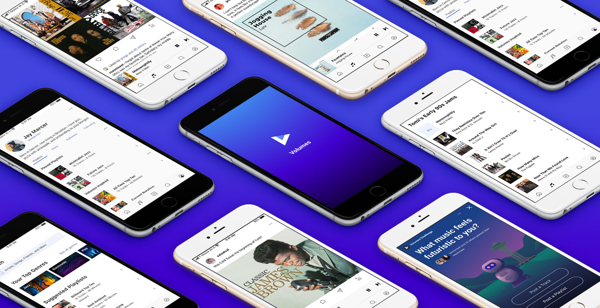
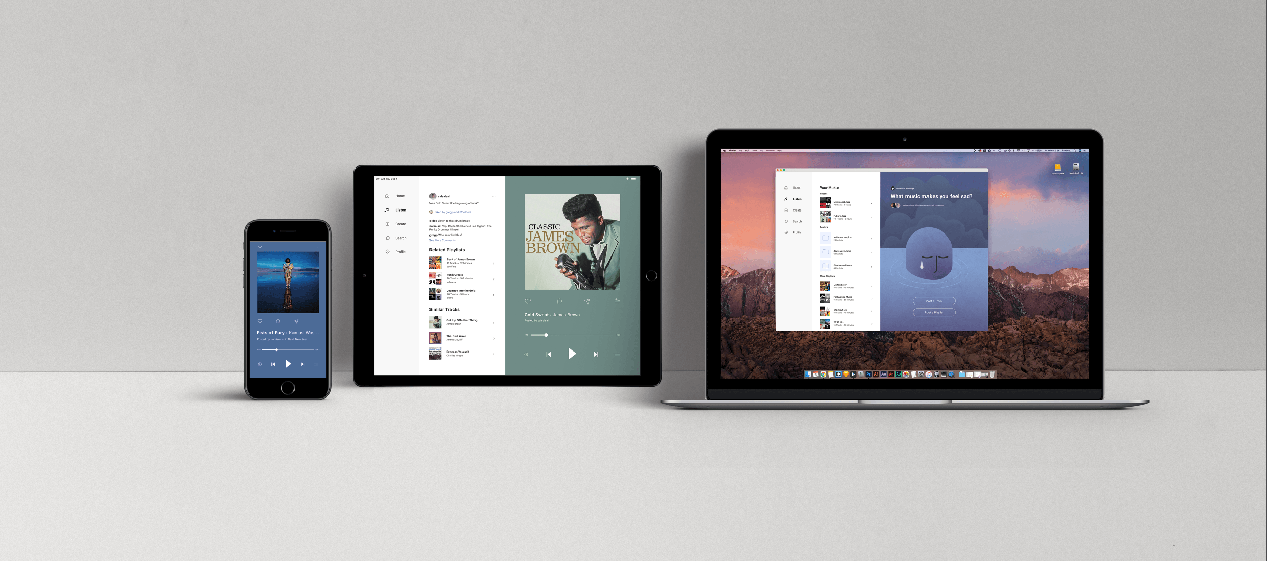
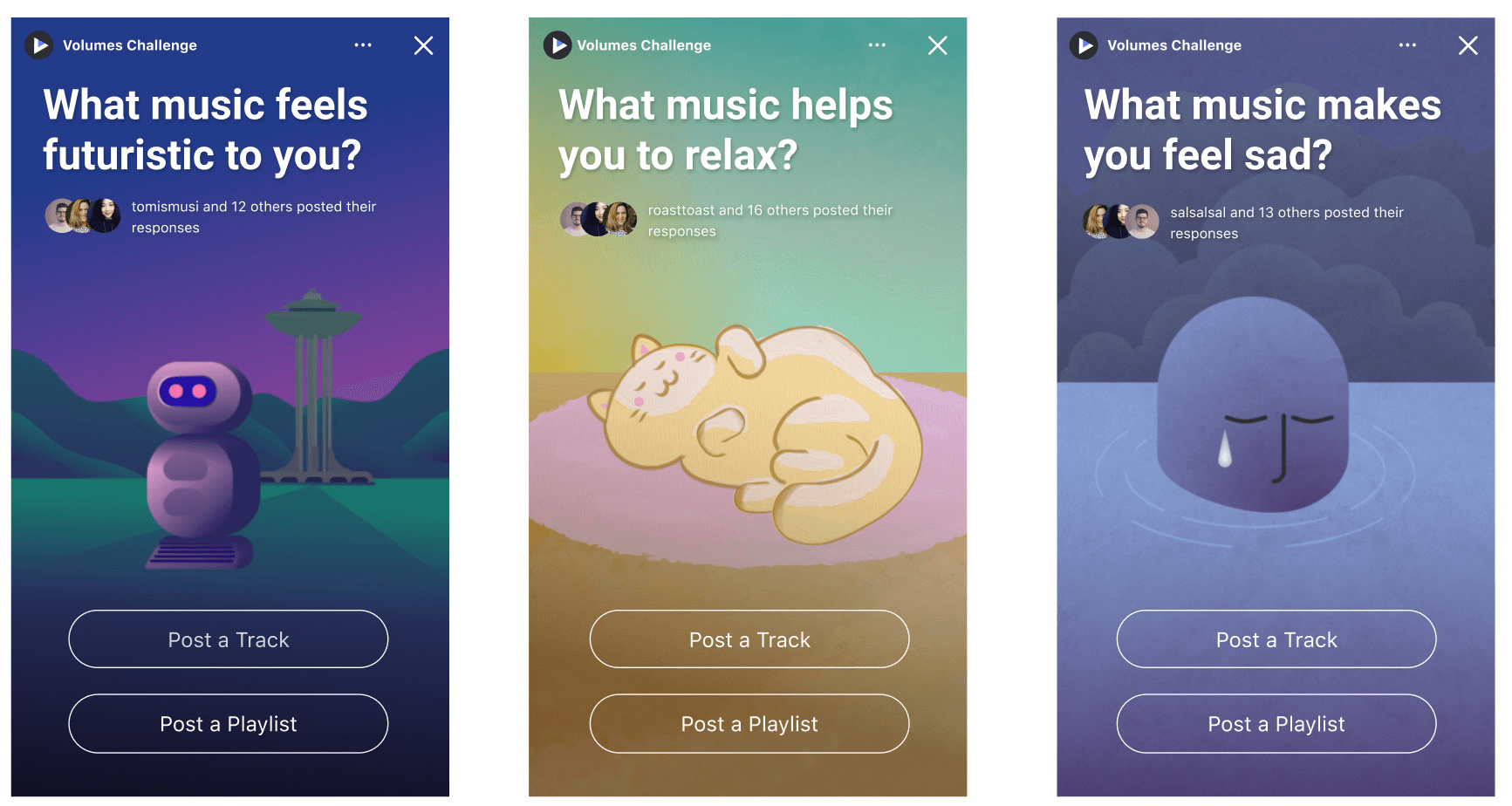
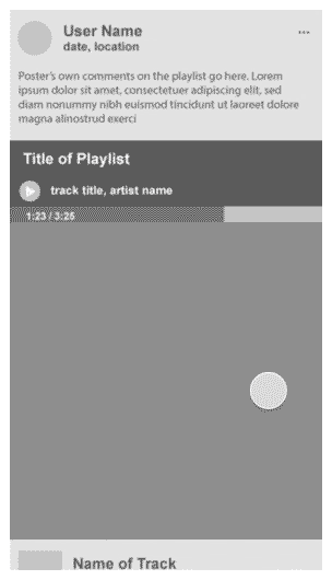
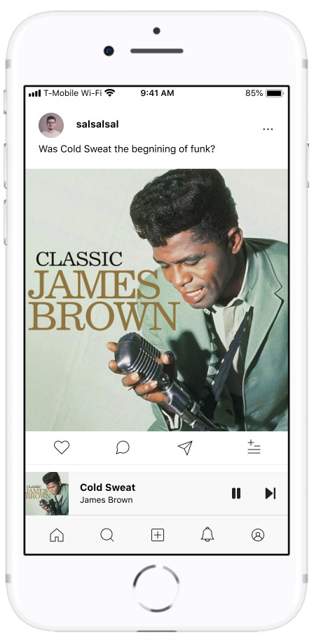
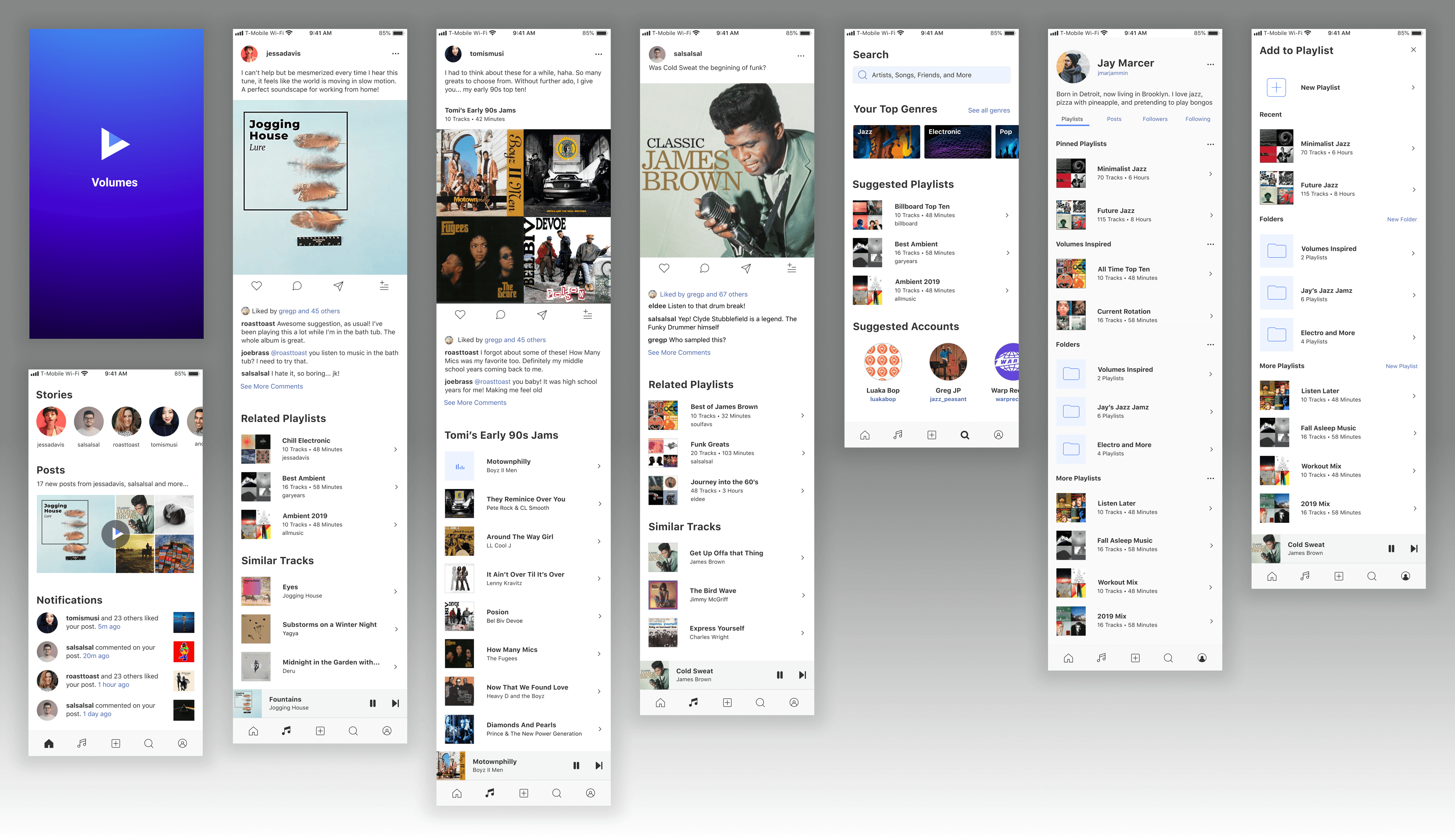
I envision a system where finding new music you love is easy. Find a friend whose musical tastes align with your own, follow them, and see what they recommend. Or follow a label whose artists you love and get updates whenever they release a new track.

competition

Information Architecture

Separate solutions for social networks and music apps are well-trodden territory. Before I went any further, I wanted to get a detailed look at previously conceived solutions. What features did they all have in common and in what ways might they be incompatible?

My own app would be heavily influenced by my competitor analysis in order to create a familiar experience for users.

Sketching and Wireframes

Using the direction from my research and inspiration from the competitive analysis, I combined the most obvious elements together into a very rough wireframe as a starting place.

early wireframe

Wireflow

As the app took shape, I created more elaborate user flows with my wireframes to figure out the interactions —

wireflow

Part 3

Build + Test


Lo-fi Prototyping

My early prototype featured vertically scrolling posts, similar to other social media apps. However, this means that if a user wants to see the next post, they need to scroll a long time to get past all of the Comments and Similar Tracks.

Initially, I experimented with a collapsed design that could expand when clicked. But that would mean I would need to hide crucial sections behind “See More” buttons. Fortunately I thought of a totally different format for the next prototype.

early wireframe
❌    Vertical posts: Too much scrolling!

The experience is not about quickly skimming through still images — It’s about taking time to enjoy the music, reading friends’ comments and discovering new artists.

Giving each post it’s own “page” which can be swiped horizontally when finished allows faster navigation between posts, more focus on the currently playing post, and provides the needed vertical space for Comments and Similar Tracks. It also allowed me to integrate Story-style posts into the main timeline rather than keeping it a seperate interaction like other social networks.

early wireframe
✅    Horizontal posts: Faster browsing.
prototype

Hi-fi Prototyping

After testing the basic functionality myself, it was time to create a higher-fidelity prototype and start user-testing. I added just enough visual design to give the app some hierarchy and included some filler content for users to interact with.

User-Testing

I wrote a list of ten tasks for users to complete which would help me see if the content was clear and if the navigation was intuitive.

After a few tests, I noticed users not quite understanding some of the navigation menu so I paused testing to rethink my menu and make a few more small tweaks before testing with several more users until there were no more issues.


instagram

Instagram bottom navigation

Bottom Navigation Redesign

My instinct was to make the nav buttons familiar to users, so I modeled them after IG or FB where ‘Home’ shows you the Wall/Newsfeed with other users’ posts.

That's when I remembered complaints in my user interviews (and elsewhere) about Netflix unexpectedly playing loud video trailers. I didn’t want the user to start the app with unknown music immediately playing.

I thought about what the user might be seeing before opening the app, maybe a notification like “12 of your friends have made new posts on Volumes”. It would be much more natural to start the app on the Alerts screen, where they could be informed of new updates and then choose which content to interact with first.

Changing the Home icon to mean Alerts enabled me to cut the Alerts icon from the menu and replace it with a Listen icon that takes you right to the Posts.


prototype

prototype

Volumes app screenshots

Part 4

Visual Design


At this point I was ready to add the visual design and branding. The name Volumes can refer both to collections of music as well as amplitude of sound. I wanted the logo to have multiple layers of meaning as well.

The first idea that I loved implied a ‘V’, a musical note, as well as the ‘Play’ arrow but it was too complex and hard to see at icon-size.


prototype

Simplicity always wins in design and I was able to keep the form of a play arrow while keeping the ‘V’ shape:

prototype

Increasing participation and delight

One of the trends I observed on existing social media was the concept of ‘Challenges’, where a user posts music to a theme such as their ‘Favorite song from childhood’ and then challenges other users to do the same.

I envisioned official posts from the Volumes app appearing in the feed and giving users ideas of music to post. Displaying which other friends participated would be a social nudge encouraging more users to participate.

I illustrated three examples simulating different artists to represent different moods for each theme of the challenge.

challenge

Part III

Takeaways


My main takeaway was that including a common interaction merely because it is standard or familiar doesn’t mean it’s going to make sense for every app. A new app is a new experience and following its own logic will sometimes feel more natural than mimicking other apps, no matter how similar.

Initially my attitude was "this should be as much like Instagram as possible" with vertical scrolling posts and the same nav buttons at the bottom. I started running into problems that I could have avoided if I considered the app on its own terms right from the start.

Overall, I’m very proud of the design and I hope to see the app come to life someday.

icon animation