Password Reset
Case Study
THE CLIENT
AlgaeCal helps older women maintain active lifestyles with their all-natural, clinically-proven supplements.
THE PROBLEM
Customer Service was reporting complaints about our website's password reset process. Users thought the steps were confusing and didn’t think it was working.
THE RESULT
I reduced the Forgot Password process from 8 steps down to 4 steps and made the instructions more helpful and informative along the way.THE PROCESS
Without having any other details about what trouble customers were having, I decided to run through the password reset process myself. Along the way, I made notes and took screenshots of any frustrations, redundancies, or other problems. Then I compared our process to that of other sites. I looked at Amazon and Facebook since they are sites most people are familiar with but I also looked at Dr. Axe, a comparably-sized competitor's website. I wrote summaries of the steps needed in a simple spreadsheet so I could compare multiple sites at once. A red cell indicates a possible UX issue that needs examining.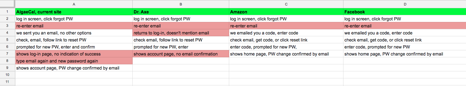
Some Observations-
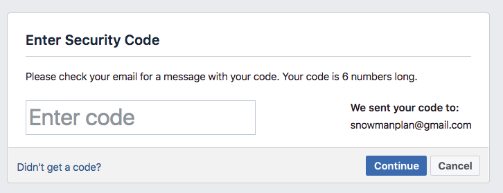
- Amazon and Facebook both email a number code for the user to confirm. This didn’t seem necessary for our site (or Dr. Axe’s) and would probably be more work than we want to put our users through.
- Every site makes you re-enter your email, even you just typed it in the last step. I know we have the technology to remember what was just typed. Unless the dev team knows a specific reason to keep this feature, that's another step we could eliminate.
- It is important to show indications when the user completes a step! Dr Axe doesn’t confirm that it will send you an email or that your password has changed. Our own site drops you off at the initial login page leaving you to wonder if it worked or not. If the user has already typed their new password twice, let’s let them in already! No need to type everything all over again.
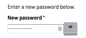
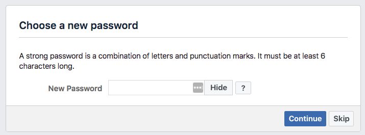
- When typing new password, the characters are hidden as •••• by default. The AlgaeCal site has an ‘eyeball’ icon that I haven’t seen anywhere else. It’s too ambiguous and possibly creepy:
Facebook uses a simple text switch saying “Show/Hide password” which feels much more natural:
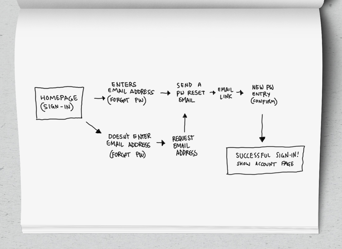
I kept all all of these observations in mind as I sketched out a basic user flow for the new process.
-
All of the redundant calls for re-typing a password would be removed.
- The need to sign-in a second time would be removed.
- The user will not be abandoned on a meaningless page or left uninformed about what’s happening.
Afer showing this new user flow to the marketing manager, I Iearned there was a crucial detail missing. While it was true that some users will want to see the account page after signing in, the vast majority of them actually are signing in while in the middle of a purchase. While in checkout, they are asked to sign-in to avoid having to type their shipping address, etc. In that case, they don’t want to go to their account page at all — they need to go back to checkout to complete their order. It was suggested to end the process with a ‘Password Change Complete’ page containing links to various places the customer may wish to go next: their account page, checkout, or the products page. I thought we could do better, though. The user shouldn’t need to tell us where they want to go. Why not just automatically take them to where they left off? For example, if they are in Checkout when they click “Forgot Password”, we can use a unique link that brings them back to Checkout. The COO was happy with my solutions:

Can we build and test it? The development team is waiting for our planned switch to a new e-commerce platform but they are glad to have an improved design to build when setting it up. What did I learn? There is always more to know about a project than what is in the brief. It is important to ask questions about what the user’s goals are when they begin any process. I’m thankful that my user flow included the steps before and after the process in question so that it is easy to see how the design fits into the bigger picture.